
 By Muhammad Irfan Liaqat
How to Pick Colors That Actually Work Together
Stop guessing with colors. Learn the 60-30-10 rule, five color relationships that always work, and how to build a palette you won't regret in six months.
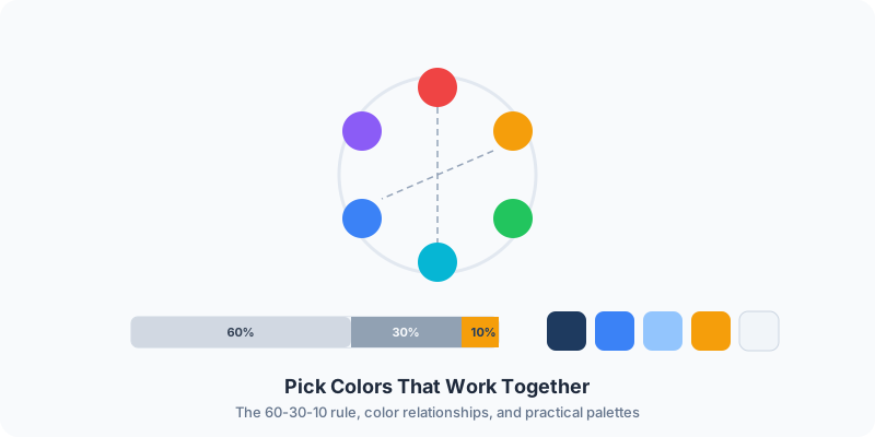
Picture a bakery website with a great logo, beautiful photos, and carefully chosen fonts, then navy blue and hot pink on top. It looks like a nightclub having an identity crisis inside a pastry shop.
Each of those colors can look good on its own. The problem is that nobody checked whether they work together. That's the most common mistake in choosing colors for a website, a brand, or a social media template: you pick favorites, not combinations.
There's a system for this. Color theory sounds like something you'd study in art school, but the practical version takes about ten minutes to learn.
Why Color Matters More Than You Think
A 2006 study by Gitte Lindgaard and colleagues, titled "Attention web designers: You have 50 milliseconds to make a good first impression!", found that people form a first impression of a web page in about 50 milliseconds. A separate 2006 study by Satyendra Singh found that 62-90% of snap judgments about people and products are based on color alone. Put together, color is doing a lot of the work before anyone reads a word.
Color affects how people feel about your site before they read a single word. The wrong palette makes a serious business feel amateurish. The right one makes a side project look like a funded startup.
But here's what actually matters day-to-day: consistency. A cohesive color palette means every page, every button, every heading looks intentional. Without one, you're making color decisions on the fly — and they will clash.
The 60-30-10 Rule
Interior designers figured this out decades ago, and it works just as well on screens.
- 60% — Primary color. This covers your background and large surfaces. Usually a neutral — white, light gray, or a very light tint of your brand color.
- 30% — Secondary color. Headers, sidebars, cards. This is where your brand identity lives.
- 10% — Accent color. Buttons, links, highlights, calls to action. The color that pops.
Here's a practical example. Say your brand color is a deep blue:
| Role | Percentage | Example |
|---|---|---|
| Primary (backgrounds) | 60% | #F8FAFC (near-white) |
| Secondary (headers, cards) | 30% | #1E3A5F (deep blue) |
| Accent (buttons, links) | 10% | #F59E0B (amber) |
That amber accent against the deep blue creates contrast without clashing. The near-white background keeps everything breathable.
If every element competed for attention at equal volume, nothing would stand out. The 60-30-10 ratio creates visual hierarchy — your eye knows where to look first.
Five Color Relationships That Always Work
You don't need to memorize a color wheel. You just need to know five patterns.
Complementary
Two colors opposite each other on the wheel. High contrast, high energy. Blue and orange. Purple and yellow. Red and green — careful with that last one, it screams Christmas unless you desaturate both.
Best for: Call-to-action buttons, headlines, anything that needs to jump off the page.
Analogous
Three colors sitting next to each other on the wheel. Blue, blue-green, green. Orange, red-orange, red. They're harmonious because they share undertones.
Best for: Websites that should feel calm and cohesive. Nature brands, wellness, lifestyle.
Triadic
Three colors evenly spaced around the wheel, forming a triangle. Red, yellow, blue. Orange, green, purple. Vibrant and balanced.
Best for: Children's brands, creative agencies, anything that should feel energetic and playful.
Split-Complementary
Like complementary, but instead of the direct opposite, you take the two colors adjacent to it. Less tension, more nuance. Blue with red-orange and yellow-orange instead of just orange.
Best for: Almost everything. It's the safest "interesting" palette. You get contrast without the head-on collision of pure complementary pairs.
Monochromatic
Different shades and tints of a single color. Light blue, medium blue, dark blue. Simple, elegant, and genuinely hard to mess up.
Best for: Minimalist designs, professional services, portfolios. When in doubt, go monochromatic.
How to Build a Palette from Scratch
Five steps take you from a single color to a complete palette.
Step 1: Start with one color
Pick your brand color. If you don't have one yet, think about what your brand should feel like. Trustworthy? Go with blue. Energetic? Orange or red. Natural? Green. Creative? Purple.
Don't overthink this. Pick one color and commit.
Step 2: Generate the palette
Use a Color Palette Generator to build any of the five relationships above from your base color. This is where math does the work for you — color relationships that are mathematically sound almost always look right to the human eye.
Step 3: Choose your neutral
Every palette needs a neutral for backgrounds and body text. Pure white (#FFFFFF) and pure black (#000000) are fine, but they can feel harsh. A common fix is to tint neutrals slightly toward the brand color:
- Cool brands: add a bit of blue to your gray — something like #F1F5F9
- Warm brands: add a touch of warmth — something like #FFFBEB
Step 4: Check contrast
This is the step people skip, and it's the one that matters most for accessibility. Your text needs to be readable against your background. The WCAG standard says the contrast ratio should be at least 4.5:1 for normal text.
Our Color Picker converts between HEX, RGB, and HSL formats — useful when you need to adjust a color's lightness to hit that contrast target without changing the hue entirely.
Step 5: Limit yourself
Here's the discipline that separates good palettes from messy ones: use no more than five colors. One primary, one secondary, one accent, one neutral light, one neutral dark. That's your entire system. Anything beyond that and your design starts looking like a bag of Skittles.
Common Color Mistakes
Using too many colors
Three to five is the sweet spot. A site with eight or nine colors and no logic to which appears where looks like the designer opened a crayon box and said "yes" to everything.
Ignoring accessibility
About 1 in 12 men have some form of color vision deficiency, and it's much less common in women. If your critical information relies solely on color — red for errors, green for success — those users miss it entirely. Always pair color with text labels or icons.
Picking colors in isolation
A color that looks gorgeous on its own might clash horribly next to your other colors. Always evaluate colors in context — in the actual layout, next to the actual elements they'll sit beside.
Following trends blindly
Every year brings a new look, from soft pastel gradients to dark mode with neon accents. Trends come and go. Your brand colors need to work for years, not months. Pick something you'll still be comfortable with in three years.
Not testing on mobile
Colors render differently on different screens. That subtle teal might look great on your calibrated monitor and appear washed out on a phone. Always check your palette on at least one mobile device before committing.
Quick Color Pairings That Work
If you need a starting point, these combinations are dependable:
| Pairing | Hex Codes | Mood |
|---|---|---|
| Navy + Gold | #1B2A4A + #D4A843 | Professional, premium |
| Forest + Cream | #2D5016 + #FFFDF0 | Natural, organic |
| Coral + Charcoal | #FF6B6B + #2D3436 | Modern, energetic |
| Slate + Mint | #475569 + #6EE7B7 | Tech, clean |
| Deep Purple + Light Gray | #5B21B6 + #F3F4F6 | Creative, sleek |
| Warm Red + Off-White | #DC2626 + #FEF2F2 | Bold, confident |
These aren't rules. They're starting points. Grab a pair you like, tweak the shades, and make it yours.
The Color Checklist
- ☐Start with one strong brand color
- ☐Generate a palette using a color palette tool
- ☐Apply the 60-30-10 rule for visual hierarchy
- ☐Check text-to-background contrast (4.5:1 minimum)
- ☐Limit your palette to five colors or fewer
- ☐Test on both light and dark backgrounds
- ☐View on a mobile device before finalizing
- ☐Don't rely on color alone for meaning — add text labels
Color isn't magic and it isn't random. It's a system with clear patterns that anyone can learn. Start with one color, pick a relationship pattern, maintain the 60-30-10 hierarchy, and check your contrast ratios. You'll stop guessing and start building palettes that look like someone who knows what they're doing put them together. Because you did.